VAI-CLIP Desktop UI Design System · 页面结构与视觉设计指南
Status: Active project-level standard
Applies to: all desktop clinical and operational workspaces
Last updated: 2026-09-10
唯一现行入口:本文件。用于其他页面改造时调用,涵盖页面结构、表格展示、信息层级、设置与动作位置,以及配色和共享组件。
This document is the shared visual and interaction baseline for VAI-CLIP desktop interfaces. Product PRDs may add domain-specific requirements, but must not silently redefine these foundations. When a local PRD conflicts with this standard, the later confirmed business or safety requirement takes precedence and the exception must be documented.
0. 改造页面时先读什么
本指南从 Appointment、Registration、Cashier 和 Drug Dispensing 已有规范与页面提炼呈现方式,不复制各领域的业务状态机。界面文案默认英文;说明文档可以中文。
- 用 §4.0 确定页面骨架和动作位置,用 §4.2 确定表格效果。
- 用 §8 选择最接近的页面范式,按对象与任务调整宽度,不机械复制整页。
- 用 §2 选取已有配色、字号和尺寸,按 §9 找共享组件与调用模板。
- 用 §7 检查实现;权限、字段和状态转换仍以对应业务 PRD 为准。
证据用语:“共享规范/已确认”是现有约束或有日期来源的决定;“改造默认”是本指南对尚未统一的细节给出的设计默认;“实现参考”仅表示当前代码值,不代表全站均已采用。补全文档不等于已完成页面迁移、联调或 UAT。
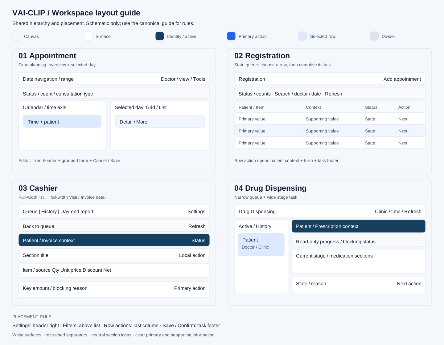
1. Principles
- Clinical clarity and task completion take priority over decorative styling.
- The same semantic component uses the same size, radius, color, state and interaction pattern across Appointment, Registration, Patient & eMR, Consultation, Pharmacy, V-Lab and Cashier.
- Color, shape or icon alone must not carry clinical, operational or financial meaning.
- Reuse shared tokens and components before adding page-local Tailwind combinations.
- A screen must remain understandable in loading, empty, error, permission-denied, read-only, disabled, stale and unsaved states.
1.1 已记录的风格偏好
- 紧凑、清楚、以任务为中心。 白色内容区、浅灰蓝背景、中性分隔,主要空间留给记录、表格和操作。不是靠缩小字号提高密度。
- 标题只承担一次定位作用。 App 窗口标题属于外壳;页面内部只保留一个紧凑标题区。Tab 已说明内容时,不再增加同名大标题、说明横幅和重复摘要。
- 信息有层级,组件不过度卡片化。 身份栏说明“正在处理谁”,分区标题说明“在做什么”,字段与表格承担细节;不为每个字段创建卡片,不堆叠 card 内的 card。
- 装饰克制。 不添加无行动价值的 KPI、hero、大图标、渐变内容卡或填空说明。磨砂按钮是现有临床参考区的局部模式,不推广为表格、录入区和整页底纹。
- 对象明确、次要内容渐进展开。 常用动作直接可见,低频维护、历史说明、来源和凭据放入设置、详情或折叠区;关键阻断原因始终可见。
来源:已有 UI 决策记录、Cashier 2026-09-07/08 版式决定,以及 Pharmacy/V-Lab 的当前工作台展示规则。历史记录中的业务细则不覆盖更晚的领域 PRD。
2. Design tokens
2.1 Radius
| Token | Value | Use |
|---|---|---|
radius-control |
6px | Inputs, selects, standard buttons, compact icon buttons |
radius-card |
8px | Cards, tables, list rows, menus and inline panels |
radius-dialog |
12px | Dialogs, drawers, important summary panels and floating editors |
radius-pill |
9999px | Status, count and category badges only |
Rules:
- Do not choose
rounded-sm,rounded-lg,rounded-xlorrounded-2xlby visual preference inside a page. Map the component to the semantic radius above. - Ordinary buttons must not use pill radius.
radius-dialogmust not be used to make routine cards appear more prominent.- Decorative or anatomy geometry may use a documented exception when it is not an interactive business component.
2.2 Control heights
| Token | Value | Use |
|---|---|---|
control-compact |
32px | Dense secondary toolbars and table utilities |
control-default |
36px | Standard form fields and secondary actions |
control-primary |
40px | Main workflow actions and important confirmation controls |
Controls in the same action group use the same height. Icon-only controls must retain a clear hit area even when their visual icon is smaller.
2.3 Typography
| Role | Minimum size | Notes |
|---|---|---|
| Micro label | 10px | Short uppercase labels and compact badges only |
| Supporting text | 12px | Metadata, help text and table labels |
| Body | 14px | Form values, descriptions and normal reading |
| Section title | 16px | Panel and dialog section titles |
改造默认:沿用项目 Tailwind
系统无衬线字体栈,不新增页面专用字体。页面标题
18–20px/600;普通分区标题 16px/600,Cashier 的主要分区沿用已确认的
18px;正文、表格值及字段值 14px/400,关键姓名/小计
14px/600;表头、次级身份和辅助说明至少 12px。正文行高约
1.4–1.5,金额用等宽数字(tabular-nums),不要求整页等宽字体。10px
只用于非关键短标签,不用于患者身份、药品、剂量、金额、状态说明或可操作字段标签。
Cashier 底部核心金额的 30–32px 是财务决策区实现参考,不是所有页面总计或统计数字的默认字号。
- Do not use 9px for body content or information required for a decision.
- Truncated patient, service, module or record labels must expose the full value through an accessible tooltip.
- Numbers that drive clinical or financial decisions must not be visually weaker than their label.
2.4 Color and surfaces
- Use semantic roles instead of scattering hardcoded hex values: application background, panel surface, muted/read-only surface, primary action, selected state, success, pending/warning, risk/error and dark clinical header.
- Blue represents primary action or selection; green represents completed/safe success; amber represents pending or warning; red represents risk, error or destructive action.
- 临床摘要与临床抽屉的深色标题使用统一深海军蓝语义令牌,安全状态需要时可使用其他颜色。按 2026-09-05 用户确认,Clinical Reference 整体改为医生工作台的浅色界面,复用区块标题、卡片及磨砂按钮,不再使用独立深蓝标题栏。Cashier/Dispensing 的患者或已选业务对象栏继续使用深蓝;不能把这项例外扩展为取消所有身份栏。
- A state must include text and, where useful, an icon; color is supplementary.
- Read-only fields must look different from editable inputs without reducing text contrast.
以下为 varclip_vue/src/assets/main.css
真实存在的变量。优先引用变量,不在新页面复制 hex。
| 角色 | 颜色 | 现有 CSS 变量 | 放置位置 |
|---|---|---|---|
| 页面底色 | #F4F7FB |
--workspace-canvas |
工作区背景 |
| 主内容面 | #FFFFFF |
--workspace-surface |
表格、表单、分区与弹窗 |
| 次级面 | #F8FAFC |
--workspace-surface-muted |
表头、只读摘要、次级分隔区 |
| 深蓝身份栏/实心选中 | #173F5F |
--workspace-clinical-header |
当前患者/Visit/历史发票身份;.workspace-selected |
| 深蓝辅助色 | #1F5575 |
--workspace-clinical-header-accent |
受控的身份栏辅助表现 |
| 主要交互蓝 | #2563EB |
--el-color-primary |
主动作、链接、输入选中 |
| 强调蓝 | #1D4ED8 |
--el-color-primary-dark-2 |
强调/hover;Cashier 当前主按钮 |
| 浅蓝底 | #EFF6FF/#DBEAFE |
--el-color-primary-light-8/--el-color-primary-light-7 |
行 hover/行选中改造默认,不用作浅色正文 |
| 完成/成功 | #059669 |
--el-color-success |
完成结果、明确成功反馈 |
| 待处理/警告 | #D97706 |
--el-color-warning |
待核、警告,搭配文字与图标 |
| 错误/风险/破坏动作 | #DC2626 |
--el-color-danger |
阻断、错误、危险操作;不用于普通下游阶段 |
| 边框/弱分隔 | #DBE3EF/#E8EEF6 |
--el-border-color/--el-border-color-light |
分区边界/表格行分隔 |
| 主文字/常规文字 | #172033/#475569 |
--el-text-color-primary/--el-text-color-regular |
重要值/标签和辅助正文 |
实心导航选中是深蓝底白字;表格行选中是浅蓝底深色字;可执行主按钮是交互蓝。三者分别表达“所在位置”“所选对象”“下一步动作”,不要混用。成功/警告原色并不自动适合白字小徽章,实际字色与背景配对须检查可读性。
App
launcher/窗口外壳现有模块渐变不等于新的业务语义颜色。AppWindow
会注入 --app-primary-button-background,Cashier
又有局部蓝色覆盖;检查最终计算样式后再迁移,不通过添加更多页面级
!important 解决冲突。
2.5 Spacing and elevation
- Use the 4px spacing rhythm: 4, 8, 12, 16 and 24px.
- Routine in-page cards use a border and no elevation by default.
- Menus, popovers, drawers, dialogs and floating editors may use elevation.
- Do not combine a strong border, ring and shadow on the same resting component without a state-based reason.
改造默认:工作区外边距 16px(宽屏可 20–24px);相邻主分区 16px;分区内部 16px;字段组间距 12–16px;按钮组间距 8px。紧凑模式优先将间距减到 12px,不缩小关键文字或命中区域。普通分区是 1px 浅边框、8px 圆角、无明显阴影;阴影集中用于菜单、弹窗及抽屉。
§2.1 的 radius-control/card/dialog 在代码中分别为
--workspace-radius-control/card/dialog,默认
6/8/12px。控件高度、间距和字号的名称是设计约定,并不存在同名
control-primary 等 CSS
token;实现时用现有组件尺寸或 Tailwind
工具,不引用不存在的变量。
3. Buttons and icons
2026-09-10 用户确认: Action 按钮优先使用现有
Element Plus el-button
及兼容的项目共享封装;统一主次层级、尺寸、loading、disabled、图标与主题。不要为每个页面用原生
<button>+局部样式重建另一套动作按钮。已有封装先核对其实际实现,缺失行为优先补到共用组件;导航、日期格和可选择数据行保留各自语义。
3.1 Icon completeness by component role
Every user-triggered command button in the scoped desktop workflows must have a recognizable Iconify icon. This includes create, edit, save, search, refresh, filter, upload, attach, check-in, prepare, send, handoff, reschedule, history, remove, cancel and close actions.
Every App registered in the desktop or mobile launcher must declare an approved icon. Persistent primary navigation that moves between materially different business domains—such as Service Items, Products, Coupons and Contracts—also uses a leading semantic icon. Inline tabs that only switch presentation or status remain text-first and do not receive decorative icons.
The following controls do not require decorative icons because their text or data is the control itself:
- presentation/status tabs and segmented view selectors;
- calendar dates, time slots and patient/list rows;
- status filters and category chips;
- radio-like option groups;
- pagination numbers.
Icons must not be added merely to fill space. If an item is actually navigation, status or a selectable data row, keep that semantic pattern instead of turning it into an action button.
Literal command-button coverage is enforced by
varclip_vue/tests/iconCoverage.test.mjs. A semantic
exception must use a non-empty data-icon-exempt reason and
is limited to the control categories above; an empty exemption or an
exemption used to bypass a missing command icon is a defect.
3.2 Icon source and style
- Use Iconify only. Prefer the existing Material Design Icons
(
mdi:) family for operational actions. - Do not use emoji, text glyphs, CSS-drawn arrows or unrelated record icons as substitutes.
- App tiles use a 24–32px glyph, persistent module navigation uses 16–20px, and command buttons use 14–18px. The containing control owns its hit area; icon dimensions do not change control height.
- App logos render through the shared
AppIconTile: compact desktop launchers use a 56px tile with a 32px glyph safety area and a 96px label column; mobile cards use a 48px tile with a 28px glyph; Start Menu rows use a 28px tile with a 16px glyph. Tiles are centred in their grid cell and labels reserve two consistent lines so single- and double-line App names do not shift adjacent logos. - Page code must not apply page-local translate/scale corrections to
individual App logos. Optical centring, glyph shadow, tile radius and
fallback initials belong to
AppIconTile; a genuinely malformed glyph is corrected once in the shared icon map. - Use one icon for one business meaning across modules. Examples:
| Action | Preferred icon meaning |
|---|---|
| Add appointment | calendar plus |
| Reschedule appointment | calendar clock/edit |
| Check in patient | account check |
| Edit patient information | account edit |
| Duplicate patient check | account multiple check |
| Add attachment | file/paperclip plus |
| Maintain insurance card | card/account-card edit |
| Record vitals | heart pulse |
| Ready for consultation | doctor/check-circle |
| Billing handoff | cash-register/arrow-right |
| Save | content save |
| Refresh | refresh |
| Search | magnify |
| Filter | filter variant |
| History | history |
| Close | close |
If a preferred Iconify glyph does not exist, choose the nearest clear business meaning and record the mapping in the shared component or icon map; do not invent a page-local metaphor. Unknown names must not silently ship as the generic fallback: icon coverage tests must prove that every literal Iconify name resolves to a bundled glyph or an explicit semantic alias whose target is bundled.
3.3 Text and icon-only buttons
- Primary and clinically or financially consequential actions retain visible text and use a leading icon.
- Icon-only buttons are limited to conventional compact utilities such as Close, Back, Previous/Next, Refresh, Expand/Collapse and Overflow.
- Every icon-only button must have:
- an accessible name through
aria-label; - a visible tooltip on mouse hover and keyboard focus;
- a keyboard-visible focus state;
- disabled and loading behavior where relevant.
- an accessible name through
- Browser-native
titlealone is not the target tooltip pattern. Use the shared tooltip component when available. - Destructive actions retain visible text in dialogs and must not rely on a trash icon alone.
3.4 Button hierarchy
- One task region should normally have one primary action.
- Secondary actions use bordered or neutral treatment; tertiary utilities use ghost treatment.
- Cancel remains visually secondary. Destructive actions use red only when the operation is actually destructive.
- Loading buttons keep their width, replace or animate the icon consistently and prevent duplicate submission.
- Reversible view changes such as filters, tabs and layout switches may apply immediately. Irreversible or ledger-affecting actions such as cancellation, invoice posting, payment collection and package consumption/reversal require a review or confirmation step and must display the affected object and outcome. Day-end Report generation is a reporting action; it does not introduce cash reconciliation or Period Close.
- A control must not appear enabled when it has no implemented handler or supported workflow. Hide it until the capability exists, or render it explicitly disabled with an honest availability explanation.
3.5 Administrator maintenance action placement
- Every administrator-facing Catalogue, directory or master-data maintenance page has one page-action group aligned to the right side of its page title header. A full-height maintenance Drawer treats its Drawer header as the page header for this rule.
- The stable left-to-right order is: passive utility such as
Refresh→ data transfer such asBulk import→ the single primary create action such asNew item. Responsive wrapping must preserve that semantic order. Bulk importsits immediately before the primary create action. It must not occupy a separate body row or appear inside the search/filter toolbar.- A page-level create action must not be duplicated in the filter bar or ordinary page body. A true zero-record empty state may repeat the same create action to explain the recovery path.
- Row actions (
Edit,Open,Deactivate), section-scoped actions (Add exception,Add line) and form/drawer footer actions (Save,Cancel) remain next to the object or task they affect; they are not moved to the page header. - Controls in the page-action group use the same height, icon-leading label pattern and secondary/primary hierarchy. At the desktop baseline, the action group wraps as a unit instead of pushing the page title off screen.
- This placement rule is not automatically applied to Appointment, Registration, Consultation, Cashier or other task-oriented workspaces. Those pages order and place actions according to workflow frequency, clinical/financial risk and the current task context.
4. Navigation, cards, forms and overlays
4.0 页面骨架、层级与动作坐标
默认结构:一个定位区,一个当前工作区。 浏览列表、处理单个对象和设置属于不同页面模式;不要为了统一外观强迫它们使用同一种左右分栏。
| 层级 | 放什么 | 展示规则 | 不应混入 |
|---|---|---|---|
| 0 · App 外壳 | App 名、窗口控制 | 复用 AppWindow,不在业务组件重建窗口条 |
业务主操作、业务状态 |
| 1 · 页面标题区 | 页面名;业务主导航;右侧全局工具 | 紧凑白底、下边框;同一页面只保留一次标题 | 大面积说明、重复患者摘要 |
| 2 · 视图与筛选 | 状态/数量、搜索、日期、医生、诊所 | 紧邻其影响的列表;同类条件在一起,必要时分两行 | 新建动作、模板维护、保存表单 |
| 3 · 当前对象上下文 | Patient/Visit/Invoice/Prescription | 单对象处理时在正文顶部;主身份一行、次级编号与来源一行,状态/对象动作靠右 | 整页筛选、其他患者摘要 |
| 4 · 任务内容 | 表格、分区表单、阶段内容 | 占用剩余空间;白底和中性分区标题,内部信息有主次 | 无决策作用的统计卡、重复进度 |
| 5 · 决策与提交区 | 当前关键金额/阻断原因、Cancel/Save/下一步 | 长编辑/结算/配药任务固定在所属工作区底部;主体独立滚动 | 列表分页、模板配置或全局导航 |
列表页一般组合 1 → 2 → 4;对象工作页一般组合 1 → 3 → 4 → 5。短列表和只读页面不强加固定提交栏。状态筛选是可操作的条件;只读进度带是提示,不能伪装成可以跳步的导航。
动作位置矩阵(跨页面改造默认;Cashier Settings 为已确认规则)
| 动作类型 | 固定归属位置 | 视觉与行为 |
|---|---|---|
| Settings/模板/低频配置 | 页面标题区最右侧,独立于搜索与业务 Tab | 轻量 32–36px
齿轮按钮,aria-label="Settings",hover/focus
tooltip;同一页面一个入口,不下沉到表格行或底部提交区 |
| 设置内返回 | 设置标题左侧 Back to [App] |
返回进入前页面并保留筛选、分页与工作内容;有未保存修改时处理后再离开 |
| 页面级 New/Add | 标题区右侧主要动作组 | 文字+图标,单一主按钮;若 Settings 同时存在,将其隔出为末端轻量工具 |
| Refresh | 工作流页面可在当前列表工具栏右端;管理员维护页优先遵循§3.5的标题动作组 | 选择一个与作用范围一致的位置,不重复放置 |
| Search/Filter/日期/诊所 | 所影响列表上方 | 不跨到无关 Tab;选择后当前范围清楚,不因无结果偷偷改范围 |
| Edit/Detail/More/下一步 | 表格最右 Action 列,或所选对象上下文栏 | 高频下一步保留文字;低频动作放 More,危险动作与常用动作区分 |
| Add line/局部编辑/局部历史 | 对应分区标题右侧 | 不抬升为整页主操作,也不复制到页面顶栏 |
| Save/Cancel/Confirm | 编辑器或工作区底部右侧 | Cancel 在左、单一主动作在右;有业务含义的“Cancel appointment”与关闭编辑器的 Cancel 不混淆 |
| Destructive/退回等异常路径 | 对象所属区域;必要时底部左侧与主动作分开 | 保留文字和必要原因/确认;红色只用于真实危险动作 |
| Pagination | 列表底部 | 只影响列表;与详情提交区分别定位 |
Settings 的默认位置不是授权新增设置能力。只有存在真实可配置对象且用户有权限时才显示;不能放一个无行为的齿轮占位。
信息层级范式
- 页面标题定位工作区;普通分区标题使用
WorkspaceSectionHeader,中性图标容器 32px、图标 16px,避免每块不同的鲜艳底色。 - 单对象身份栏:患者名/对象名最醒目;MRN、Visit、Clinic、Doctor 为第二层;状态和上下文动作在右侧。多患者列表使用普通表格行,不能每行都做深蓝卡片。
- 表格主单元格:第一行是姓名/项目名,第二行才是编号/来源;长备注去详情或展开区。药品名称、剂量、关键金额不以小字换取单行。
- 告警放在相关区块上方;一条清楚说明“为何不可继续、如何恢复”。不要在顶栏、卡片和 footer 三次复制完整告警;footer 可保留简短阻断提示。
- 附属信息按需折叠,遇到当前阻断时展开。不要折叠当前动作必须核对的金额、身份、风险与缺失项。
4.1 Navigation
2026-09-09 用户确认的层级及配置范围以 App 与配置层级 为唯一目录规范。业务类目、Start 与移动端共用注册表;Personal Settings 为全局入口,System Settings 与 Organization & Access、Audit & Review 为分开的管理 App。
页面齿轮只放当前页面的个人视图设置或通往权威编辑器的上下文快捷入口;共享规则必须标明 Clinic/Operating unit 生效范围。搜索、日期、排序、当前页签属于页面状态,不塞进系统设置。已有 Cashier 模板和临床布局快捷编辑器复用同一数据源。
2026-09-06 用户要求直接清理重复与无实际用途 App,取代此前“所有 Shell 可见”的暂行策略。CP/库存重复入口合为 Central Pharmacy,纯规划壳及本期排除的独立报表入口撤出;桌面、开始菜单、搜索和移动目录统一过滤。保留的 App 仍须区分
Visible与Implemented / Deployed / UAT accepted,清单见platform_ai_business_prd.md§9。Operations Dashboard/Report/Insights 的独立规划入口退出日常目录;2026-09-08 已确认的 Cashier Day-end Report 保留在 Cashier 内,不被此清理规则排除。Pharmacy Drug Order 重复壳撤出,医生在 Consultation 开药,药房在 Drug Dispensing 执行,不建立第二套权威数据。
Active workspace tabs use the shared blue selected treatment.
Unsaved or warning state uses a badge or indicator and must not replace the selected-tab meaning.
At 1280px and above, the active tab and critical navigation labels must not be silently truncated. Move lower-priority items into an overflow menu before cutting meaningful text.
Mouse clicks must not leave a persistent focus ring. Use
focus-visiblefor keyboard focus presentation.In a patient-bearing Queue or worklist, a saved patient's name uses the shared Patient & eMR link treatment with an open-record icon, accessible name and keyboard focus. The link carries stable Patient / Visit / Clinic / return context and must not also trigger the row's operational action.
A name without a stable Patient ID remains non-interactive and explains that the patient record must be saved first; never guess a patient by display name.
4.2 Cards and tables
- Cards with the same role use
radius-card, consistent padding and border treatment. - Data tables use Element Plus
el-tableand its related table controls. Use Tailwind for the surrounding layout and approved visual adjustments, not to rebuild table behavior with raw<table>markup. - A static document-like comparison table may use semantic HTML when
it has no table interaction. Its owning component must document why
el-tableis not appropriate. - Editable, read-only and calculated cells must have visibly distinct but consistent affordances.
- Numeric clinical and financial columns align consistently; currency and unit context must be unambiguous.
- Empty space must not be filled with decorative summary cards that do not change a decision or action.
表格展示效果(改造默认,沿用 Cashier/Registration 的共同表现)
| 项目 | 统一呈现方式 |
|---|---|
| 表格容器 | 占满当前工作区宽度;白底、1px 浅边框、8px 圆角;避免再套多层卡片 |
| 表头 | 浅灰蓝 surface-muted 底,12px/500–600
深色标签,底部细分隔;长表格在自身滚动容器内固定表头 |
| 普通数据行 | 14px 正文,白底与水平细分隔;默认不使用强竖线、深色斑马纹或每行独立阴影 |
| 密度 | 单行记录目标约 44–48px;双行身份/来源约 56–64px。行高随内容增长,不固定高度裁字;横向 padding 12–16px,纵向 10–14px |
| Hover | 非选中行浅蓝背景,不改变布局、不加投影、不表达业务完成 |
| Selected | 比 hover 更明确的浅蓝底,配清楚的选择标记/边界与组件选中语义;键盘 focus 独立可见,不使用整个深蓝数据行 |
| 文本列 | 左对齐;姓名/项目名为主,编号/来源在次行;状态短词配 badge,避免每个字段都加 badge |
| 数值列 | 金额右对齐、等宽数字、相同小数精度;Qty 固定采用同一对齐方式,单价/折扣/净额按垂直列线可比较;币种/单位清楚 |
| 操作列 | 最右,宽度稳定;容纳一个常用文字动作及 More。确需横向滚动时固定关键身份列与操作列,验证不会遮住中间数据 |
| 空值与异常 | 无值用清楚的占位/短语;未知不是 0;错误、无权限、无匹配与真空列表使用不同提示 |
| 合计 | 在金额列下对齐,使用细分隔和字重;固定决策栏只突出当前需要决定的金额,不再重复一排统计卡 |
| 列宽与小屏 | 身份/项目列优先占弹性空间,金额、状态、操作留可读宽度;次要元数据可进入详情。金额、药品剂量、关键操作不能为避免横向滚动而静默隐藏 |
以上行高是新的页面改造默认,不是已有全部表格的测试结论。可编辑单元格仍遵守 36px 默认输入高度;不要把输入、按钮压到普通文字行高。取消/历史行可以降低背景强调,但文字必须可读,并保留状态说明。
4.3 Forms
- Labels, required state, help text, validation and read-only state follow one pattern.
- Interactive data-entry controls use Element Plus components:
el-input,el-input-number,el-select,el-date-picker,el-time-picker,el-time-select,el-checkbox,el-radio-group,el-switch,el-formandel-form-itemas applicable. Tailwind controls layout and spacing; Element Plus colour variables are defined once as the global system theme. - 2026-09-10 用户确认:
表单及日历/日期/时间选择默认复用 Element
组件及当前组件库,不重新手写基础控件。当前 Vue 3 项目使用 Element
Plus;日期、日期范围、日期时间、日期时间范围采用对应
el-date-picker类型,独立时间采用el-time-picker/el-time-select。简单日历浏览优先el-calendar,业务预约排程复用既有业务日历。统一业务时区、展示/提交格式、清空与无截止日期含义、起止校验、键盘操作及弹层层级;不得把日期字符串和带时区的授权时间混用。 - Element Plus radio labels retain the regular text colour in selected and unselected states. Selection is indicated by the global primary-colour radio border and centre dot, not by changing the label colour.
- Do not introduce new raw text, number, date, checkbox, radio or select controls. Native inputs remain acceptable only where a browser-specific control is required, such as file or colour selection, or where an approved exception documents why an Element Plus component cannot meet the requirement.
- User-facing component copy defaults to English, including labels, placeholders, action text, validation, empty states and confirmation messages. Patient-provided data, clinical codes, or an approved localisation requirement may use another language.
- Save/Cancel behavior is consistent across Patient & eMR, Registration and Consultation dialogs.
- Default values must come from a confirmed business rule or authoritative source; missing information remains missing.
- Actor, clinic, payment method, reconciliation totals and transition reasons are audit data. They must be explicitly sourced or entered and must never be populated with synthetic operational defaults on a live action form.
4.4 Dialogs and drawers
- Use
radius-dialog, shared overlay opacity, header/body/footer spacing and close-button placement. - New or modified desktop dialogs use the shared
AppDialogcomponent. It wraps Element Plusel-dialogandel-scrollbar, owning overlay, shadow, shell sizing and header/body/footer slots; feature components provide task content. - Dialogs and drawers require correct semantics, focus trapping, Escape behavior and focus restoration.
- Clicking a modal or drawer backdrop never closes the surface (2026-09-10 user decision), including account creation, access requests, patient registration, clinical editing and administrative forms. Close/Cancel remain explicit actions. Escape must not discard unsaved clinical or patient data without confirmation.
版式默认:标题与关闭按钮固定在上方;只滚动
body;底部动作固定、右对齐;同一弹窗只保留一个主要任务。普通确认沿用
AppDialog 默认宽
min(100% - 2rem, 48rem),复杂预约编辑可使用页面专属宽度。大型表单不反复嵌套弹窗,附属维护优先右侧抽屉;抽屉也保持
header/滚动 body/footer。AppDialog
及自定义表单弹窗统一禁止遮罩关闭,调用方不得重新启用;Escape
可用但调用方仍必须实现未保存保护,不能认为共享壳已经替业务完成。
2026-09-11 用户确认的管理页应用:Organization & Access 按 Catalogue 统一侧栏品牌/角色上下文、导航选中态、白色页头及卡片内筛选结构;标题与刷新/新增操作同区,搜索/筛选不挤占页头。用户和角色目录使用 Element Plus 表格与操作按钮,保留 12px 及以上辅助文字、长名称换行和 App 容器内横向滚动。统一布局不复制 Catalogue 遗留的原生控件、小字号或不适用于权限页的状态声明。
4.5 Search, scope and empty states
- A search surface must state or visibly imply its data scope. Patient & eMR and appointment selection search the authorised medical-group register. Show patient clinic affiliations separately from the operator’s current assignment. Profile editing follows registration/Visit or approved receiving-clinic eligibility; a booking link alone does not grant editing. Provider-owned full Notes and historical prescriptions retain their separate access rules; see Platform PRD §4.1.
- Initial state, no matching result, permission denial, loading failure and “record exists outside the current clinic” are different states and must not share one generic empty message.
- A failed search clears any stale selection that could be acted on. Success and empty-result messages are computed after the asynchronous result returns.
- Patient creation is never the immediate default after one scoped search misses. The workflow must check the authorised group patient register or run the defined duplicate check first.
4.6 Bulk data and reporting controls
- Import, export, template download and reporting are secondary administrative tasks. They must not be inserted into a frontline clinical, registration, dispensing or Cashier workflow solely because a generic component exists.
- Every bulk action requires an explicit business object, permission, data scope, duplicate policy, validation / preview step, audit behavior and result state before it is exposed.
- Every approved bulk-import surface uses the same disclosure pattern:
the list or directory page shows one compact secondary
Bulk importlauncher, and a right-side Drawer contains template download, file selection, full-file validation, preview, duplicate handling, confirmation and result/error download. Large permanent template/upload actions and page-local import layouts are prohibited. - Executable imports must use the shared import Drawer component. A module whose persistence model is still pending may show the same Drawer contract as a clearly labelled non-executable requirement preview, but it must not simulate a write. A business exception that does not support bulk creation must hide the launcher and document the reason in its owning PRD.
Export current filteris permitted only when the control receives and displays the actual active filters. It must not silently behave likeExport all.- Date-range export is permitted only when the business object has a
named authoritative date, such as invoice posting date. Unlabelled
from / tofields and genericExport rangeactions are prohibited. - Terminology and master-data import belongs in an authorised administration or governance surface, not inside a clinician's decision-support task.
5. Accessibility and responsive behavior
- Desktop acceptance baselines are 1280px and 1366x768. Critical context and primary actions must remain reachable without unexplained horizontal clipping.
- Keyboard order follows the visible task order. All interactive
controls have a visible
focus-visiblestate. - Tooltips open on hover and focus, do not contain essential instructions exclusively, and do not obscure the target action.
- Contrast must be checked for muted text, selected tabs, disabled controls and text placed on navy headers.
- Support
prefers-reduced-motionfor nonessential motion.
布局以 App 内容容器宽度
判断,不只看浏览器宽度:窗口可能未最大化,桌面 Taskbar
和窗口条也占用高度。长页用 flex/grid 配合
min-height: 0,每个任务面板明确一个主滚动区,左右队列与详情可独立滚动,避免同面板多层嵌套滚动;固定
footer
不覆盖最后一行或横向滚动条。顶栏优先换行/收起低频项,再将左右内容改成上下结构;不靠把字体缩到
10px 保持分栏。1280px 与 1366×768
之外,检查一个窄窗口及长姓名/长项目名;不把桌面指南当作患者 H5
的移动布局规范。
6. Implementation and review requirements
- New or modified desktop components must use the semantic rules in this document.
- When a second page needs the same control, extract or extend a shared component instead of copying Tailwind class strings.
- A UI change is not complete until default, hover, active, focus-visible, disabled, loading, read-only and error states relevant to that control have been checked.
- Icon audits must classify controls before changing them: command action, icon-only utility, navigation/tab, selectable data row or status/filter.
- App registry and shared icon-map changes must run the icon coverage test. Generic fallback rendering is resilience for unexpected runtime data, not an accepted design state.
- Visual verification must cover at least 1280px and 1366x768 desktop sizes. Mobile preview does not substitute for desktop acceptance.
- Exceptions must state the business or safety reason in the owning PRD or component documentation.
- Use existing shared components and Element Plus first for forms, action buttons, selections, date/time pickers, calendar controls and interactive data tables. Use Tailwind for surrounding layout, spacing and the approved theme. Reuse AppDialog and other compliant wrappers; do not build new raw controls or introduce another UI library for the same functions. Existing specialised scheduling components retain their business behaviour. Current project dependency is Element Plus for Vue 3, not Element UI for Vue 2.
- Element Plus template components use the configured
unplugin-vue-componentsresolver, which imports only the used component and its CSS. Do not register the library withapp.use(ElementPlus)or import the globalelement-plus/dist/index.cssstylesheet. - Import Element Plus programmatic APIs, such as
ElMessageandElNotification, explicitly in the module that uses them. - Run the component contract check for every new or modified desktop
page. New and renamed Vue files receive a full check; existing files
compare individual component findings against the Git base. Existing
violations remain migration debt, not approved exceptions. Fully audit a
migrated page with
--files; the automated check supplements the complete checklist and real browser evidence. Commands and limits are maintained in component compliance verification.
7. Pull-request checklist
8. 四类页面的可复用版式
下列示意图只表示区域关系。像素值标为“实现参考”时,可以按内容容器调整;没有要求其他页面复制业务字段或状态。
8.1 Appointment · 时间与资源编排
紧凑标题/日期导航/当前范围                  页面工具
状态筛选与数量/医生/Consultation Type
┌────────────────────┬───────────────────────────┐
│ 多日/周日历         │ 所选日期 · Grid / List    │
│ 时间轴 + 预约事件    │ 当日明细/事件+Detail/More│
└────────────────────┴───────────────────────────┘
打开预约 → 共享编辑弹窗:固定标题/滚动分组表单/固定动作- 时间是组织主轴;日期导航与视图切换放在日历上方,状态/类型作为条件,不额外堆一套同义 Filter。
- 左侧用于发现时间分布,右侧用于处理所选日期。两区日历使用同一时间比例;事件高度依据时长,不能为了装下按钮把短预约拉高。
- 事件内容依次保留时间和患者姓名,再按空间增加类型、医生与状态。完整内容可通过 hover/键盘 focus 查看;极短事件点击整条进入详情,操作不溢出卡片。
- List 模式沿用 Time → Patient → Details → Actions;不要将日历事件卡片效果直接套到表格每一行。
- 编辑弹窗按 Patient → Appointment → 本次 Payment Arrangement → 资源/计划 → Notes 等任务组排布;同组字段用网格,不逐字段卡片化。Cancel/Save 在 footer 右侧,取消预约等异常路径与关闭编辑器分开。
- 实现参考: 当前桌面日历约 50/50;时间比例
80px/30分钟;编辑弹窗宽
min(1280px,96vw)、高 86vh。它们不是全站固定比例或弹窗尺寸。 - 适合复用: 资源排班、房间时间安排、按时间执行的服务工作页。预约本身的字段、重叠、改约与权限见 Frontoffice。
8.2 Registration · 状态队列与行内下一步
Registration                                      Add appointment
状态筛选+数量
Search/Doctor/Date                                      Refresh
┌───────────────────────────────────────────────────────────────┐
│ Time/source | Patient | Doctor/type | Payer | Prep | Status | Action │
│ 主身份一行;编号/来源次行;当前行显示下一步文字动作                 │
└───────────────────────────────────────────────────────────────┘
行操作 → 任务弹窗:患者栏/主表单+必要清单/Cancel+当前下一步- 当前正式入口以
PatientIntakeWorkflowApp的队列为参考;不沿用旧NurseCheckInPanel的三栏工作台作为新页面模板。 - 状态+数量是一组筛选控件,不另生成大号 KPI 卡。搜索、医生、日期和 Refresh 同属队列工具栏。
- 主表格占满余下高度;Patient 为首要识别信息,时间/来源、医生/类型为次级信息,付款安排、准备和状态保持紧凑;当前下一步位于最右 Action 列。
- 点击姓名打开病历、点击行操作处理当前 Visit,二者不连带触发。未选对象时页面仍是完整队列,不预留大片空详情栏。
- 进入签到或准备任务后,弹窗顶部保留患者上下文;主表单占大部分宽度,右侧仅放对当前任务有用的清单/摘要;窄窗口改为纵向。footer 保留当前下一步,不能在每张小卡上重复放 Save。
- 实现参考: 当前任务弹窗宽
min(100% - 2rem,64rem),辅助栏 18rem;无需把此宽度推广到所有任务。 - 适合复用: 前台待办、人工资料审核、按状态分流的服务队列。签到、准备与核验要求见 Frontoffice。
8.3 Cashier · 全宽列表与全宽对象处理
Cashier   [Checkout Queue] [Billing History] [Day-end Report]   Settings
列表页:Search/Doctor/Status → 全宽表格 → Pagination
选择 Visit/Invoice 后:
Back to Queue/当前工作名称                                     Refresh
深蓝患者/Invoice 信息栏                  状态与对象操作
必要阻断提示 → 白色分区标题 → 全宽收费/付款表格与录入
固定底部:当前关键金额/简短状态 当前单一主操作- 已确认导航: 只保留上述三个紧凑顶部入口;模板不是第四个主 Tab,也不恢复旧常驻左侧模块导航。Settings 位于右上角,内部显示 Back to Cashier,并恢复进入前工作页和条件。
- 列表与单对象详情分别使用全宽,避免用一个常驻左列表挤压收费明细。进入详情后有清楚的返回入口。
- 患者/历史 Invoice 使用深蓝身份栏;Charge review、Payment、History 等使用中性图标分区标题、白色内容和细分隔。主要分区标题 18px,表格正文 14px。
- 明细中 Item/Source 在左;Qty、Unit price、Discount、Net amount 成列对齐,金额右对齐。来源、折扣说明、明细下钻比项目与净额低一层。
- 当前需要输入付款时,将相关录入前移到可见内容区域;底部只突出本阶段需要决策的金额/状态,结算完成后突出结果而不是一个巨大的零元。完整阶段映射见 Cashier PRD,不在本页另建状态表。
- 2026-09-10 用户确认: 付款信息从本次来源承接到责任确认,再到实际付款/欠款,不重复填写或重复放置同功能组件。Invoice 的模板选择+打印收敛为结算确认后的一个入口,使用共享弹窗;结算前不铺开重复的模板、预览和打印区。交互契约见 Cashier 结账界面,业务快照与 Receipt 边界见票据规则。
- Day-end Report 先显示范围/日期,再汇总、收入来源与医生分组;凭据为下钻或折叠 Supporting records,不用患者列表代替报告主体。
- 实现参考: 当前 Settings 为 36×36px;关键金额 30–32px;财务主动作最小 44px 高、232px 宽。最后两项是该决策区的局部尺寸,不推广给所有普通按钮。
- 适合复用: 宽明细审核、订单结算、带历史查询及低频配置的运营模块。规则来源为 Cashier §2及§2.1。
8.4 Drug Dispensing · 左侧队列与右侧阶段任务
Drug Dispensing                        Clinic ▼/更新时间/Refresh
Active / History 与状态条件
┌───────────────────┬───────────────────────────────────────────┐
│ 窄队列             │ 深蓝患者/处方上下文栏                    │
│ Patient            │ 只读进度带;结算/库存提示                 │
│ Doctor · Clinic    │ 当前阶段分区内容                           │
│ 数量/必要状态     │ Prescription → Medication cards → remark │
│ 选中项浅蓝         │ 固定底部:状态/阻断原因+唯一下一步        │
└───────────────────┴───────────────────────────────────────────┘- 诊所筛选在标题工具栏右上与 Refresh 同排,不铺开一整行诊所 Tab;完整诊所名可读。
- 左栏只帮助选择对象:患者、医生/诊所、必要数量及工作/结算状态。药名细节、日期编号、完整处方放右侧,避免两边重复。
- 右栏顺序稳定:对象上下文 → 只读进度 → 独立交接/阻断提示 → 当前阶段内容 → 固定动作区。进度带不提供任意跳步入口。
- 内容层级清楚区分整张 Prescription、药品卡片、各自 remark。整张备注在药品列表外只出现一次;空备注隐藏;患者说明与内部备注分别呈现。
- footer 靠近当前执行对象,展示当前状态/下一状态与阻断,主操作在右。自动刷新不清空同对象、同版本、同阶段的录入;过期或更新失败要可见。
- 实现参考: 当前左栏 272–320px、右栏取余宽,主 gap/padding 16px;≤900px 时左栏约224–256px、gap 12px。继续变窄时应重排,不能无限挤压表单。
- 实施边界: 当前队列仍有逐药执行行,整张处方聚合与部分阶段尚未闭环;本指南复用的是信息与版式层级,不认可逐药列表为最终业务对象。见 Pharmacy/V-Lab 的实施矩阵。
- 适合复用: 需要连续选单、按阶段核对和执行的工作台,例如内部检查承接;字段、状态与门禁由其领域 PRD 决定。
9. 组件入口、调用方式与现状差异
9.1 实现入口
路径相对仓库根目录;共享样式类不自动构成完整组件。
| 需要复用的部分 | 入口 | 注意事项 |
|---|---|---|
| 颜色、圆角、基础交互 | varclip_vue/src/assets/main.css |
.workspace-card
仅设圆角,不自动带背景/padding;检查最终计算样式 |
| 页面外壳 | varclip_vue/src/components/desktop/AppWindow.vue |
不重复实现窗口栏;注意模块按钮背景继承 |
| 分区标题与右侧局部动作 | varclip_vue/src/components/desktop/apps/consultation-workspace/WorkspaceSectionHeader.vue |
默认16px标题,使用 trailing slot;Cashier
主要标题18px是本域规范 |
| 通用弹窗 | varclip_vue/src/components/ui/AppDialog.vue |
header/body/footer 分开;业务负责未保存与版本检查 |
| 轻量图标工具 | varclip_vue/src/components/ui/IconActionButton.vue |
标准 tooltip、accessible name、focus;Settings可沿用此模式 |
| 患者姓名链接 | varclip_vue/src/components/desktop/PatientEmrLink.vue |
稳定ID及返回上下文,避免连带触发行操作 |
| 当前/下一状态提示 | varclip_vue/src/components/ui/WorkflowTransitionSummary.vue |
提示不是任意切换状态的控件 |
| 预约与本次付款安排 | varclip_vue/src/components/desktop/apps/appointments/AppointmentEditorDialog.vue、varclip_vue/src/components/desktop/apps/PaymentArrangementSection.vue |
跨预约/登记复用;不另做不同的同义表单 |
| 结构参考 | AppointmentsCalendar.vue、PatientIntakeWorkflowApp.vue、DrugDispensingWorkspace.vue(均在
varclip_vue/src/components/desktop/apps/);该目录
cashier/CashierWorkspaceApp.vue |
复用 §8 的结构,不整页复制旧局部样式 |
9.2 给设计/开发代理的调用模板
请改造 [页面/组件]。
先读 agent_docs/product/desktop_ui_design_system.md 的 §4、§8、§9,
再读该领域 canonical PRD 与当前实现。
采用 [列表+任务弹窗 / 全宽列表到全宽详情 / 左队列右任务 / 时间编排] 范式。
按本指南确定标题、导航、筛选、对象上下文、表格、Settings 和底部动作的位置。
保持当前业务规则与权限边界;如果必须改变,在领域 PRD 单独明确。
复用 main.css、Element Plus、WorkspaceSectionHeader、AppDialog、IconActionButton。
先列出该页面与共享规范的差异,再实现;局部旧样式不能作为新增例外的依据。
核验1280px、1366×768及窄 App 窗口下的表格、长内容、滚动、固定动作和相关状态。
交付页面变化、视觉证据和未完成差异;不把指南发布当作业务验收。
9.3 当前差异及来源边界
2026-09-10 用户确认本轮先修共享组件库,暂不修改具体业务板块 UI。下列业务页面差异继续保留;共享组件与合规检查的实际验证状态见 组件合规验证,不代表业务页面已完成迁移:
| 观察到的差异 | 后续改造应遵守的规则 |
|---|---|
Registration 的正常下游 Ready for cashier 仍有 rose
标签;部分页面有10/11px普通说明和偏小主按钮 |
正常阶段不表达为危险;关键正文与动作遵守 §2,不能将历史值升级为规范 |
| Cashier 当前局部表头/hover为灰色;其他表格有主题色;部分字号、边框未完全归一 | §4.2 是改造默认,先看现有效果与计算样式,再通过共享层逐步统一 |
DayEndReportWorkspace 的
date/select、CashierReportTable
的带下钻表格仍为原生控件;Access 与用户管理也有待迁移表单 |
作为迁移差距保留,本轮暂不改业务页面;不因此放宽 Element Plus 输入和交互表格规则 |
共享导入 Drawer 仍有旧主色和原生控件;部分 tooltip 依赖旧
title 适配 |
可复用业务结构,需检查视觉/键盘行为;共享名称本身不证明合规 |
| 部分页面仍有重复标题、说明横幅、模块渐变按钮与纯色按钮并存 | 按 §1 和 §4 保留必要层级,逐页迁移;本次未更改全局主题 |
| 旧规范要求 Clinical Reference 深蓝标题;最新 STG 已记录2026-09-05浅色方案 | 采用已确认的浅色例外,保留 Cashier/Dispensing 的深蓝身份栏,不把分支差异当作所有页面已同步 |
指南结构提炼时的来源核对(2026-09-09
历史快照,非当前发布状态):当时已 fetch,开发分支
origin/dev/theron-li 为 0a80d95,STG 为
f3f5e0e;已比较共享规范/样式差异并吸收较新确认记录,未将
STG 的其他临床代码合入本轮。后续须重新核对最新分支。WS1、WS4、WS5
已用于核对真实入口和实施边界;本轮没有改变其功能状态。
历史截图(含8月患者/预约截图、9月7日 Cashier 截图)只用于核对当时视觉表现,不作为最新导航或业务完成证据。本文结构图是无患者数据的规范示意,设计默认与运行截图分别辨识。